Academic Conference Poster Template
An Inkscape SVG poster template for A0 portrait (841 × 1189 mm) academic conference posters. Clean three-column grid with pre-labelled sections for introduction, methods, results, and conclusions.
You're in — download starting…
Your email joined the newsletter list. One workflow per week, unsubscribe anytime.
Download didn't start? Click here →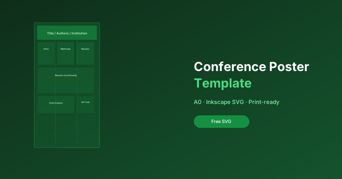
What's Included
- A0 portrait (841 × 1189 mm) Inkscape SVG file
- Three-column grid layout with snapping guides
- Pre-styled title header with institution and author name sections
- Sections: Introduction, Methods, Results, Conclusions, References, Acknowledgements
- QR code placeholder frame
- Colour scheme: blue/white with accent colour easy to change globally
- Instructions layer (can be hidden before printing)
- PDF export guide for print-ready output
Who This Is For
- Researchers presenting at their first academic conference
- PhD students who need a professional-looking poster without a design background
- Anyone whose institution doesn't have an official poster template
Printing Tips
Recommended Print Settings
| Setting | Value |
|---|---|
| Format | A0 portrait (841 × 1189 mm) |
| Resolution | 150 DPI for mixed graphics; 300 DPI for line art only |
| Colour profile | CMYK (ask your print shop) |
| Bleed | Add 3mm bleed in Inkscape export if required |
Exporting from Inkscape
- File → Export PNG → set 150 DPI for a quick proof
- File → Save a Copy → PDF with “Use exported objects size” checked for print
Common Conference Poster Sizes
This template is A0 portrait. Other common sizes:
- A1 portrait (594 × 841 mm) — scale everything to 70.7%
- A0 landscape — rotate the template in Inkscape
- 36" × 48" (US) — set document size to 914 × 1219 mm
Overview
Poster templates for the two workflows researchers actually use: a LaTeX (beamerposter) version for equation-heavy work, and a PowerPoint version for everyone else — both pre-set to A0, structured around the readable three-column layout, and styled so the title band, not the logos, dominates.
Why use it
Most conference posters fail identically: too much text, too small, no visual hierarchy. These templates enforce the fixes structurally — a findings-first headline band, column widths that cap line length, and font sizes chosen for two-meter reading distance. You fight the content, not the layout.
How to use it
- Pick your version: LaTeX for math-heavy posters, PowerPoint for speed and co-author edits.
- Replace the placeholder blocks — the layout assumes one core message, three supporting sections, and one methods/QR footer.
- Print a section at 100% scale before sending the full A0 job — colors and font sizes lie on screen.
Ready to get started?
Enter your email and I'll send the link straight to your inbox.
Every subscriber gets the full resource library in the welcome email. Free, no spam, unsubscribe anytime.
Check your inbox!
The download link is on its way. Can't find it? Check spam.
Download didn't start? Click here →