
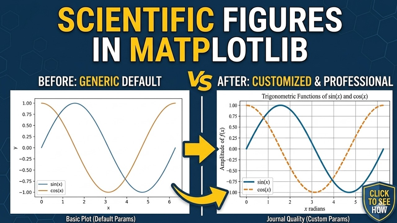
Your Matplotlib Plots Are Getting Your Papers Rejected — Here’s the Fix
You’ve spent weeks perfecting your research, written a solid manuscript, and submitted to your target journal. Then the rejection email arrives: “Figures do not meet publication standards.”
The problem isn’t your science—it’s your pixelated plots, inconsistent fonts, and low-resolution JPEGs. Journal editors see hundreds of submissions monthly. Poor figure quality signals careless work, even when your data is groundbreaking.
This tutorial transforms a basic, rejection-prone Matplotlib plot into a crisp, publication-ready figure that meets Nature, IEEE, and Elsevier standards. You’ll have a reusable workflow that produces journal-grade figures in 10 minutes instead of 2 hours fighting with Inkscape.
What You’ll Learn
- Set global rcParams for consistent styling across all figures
- Integrate LaTeX rendering for mathematical expressions
- Differentiate data using color + line style (critical for colorblind readers and grayscale printing)
- Export as vector formats (PDF/SVG) or high-DPI rasters (300+ dpi PNG)
- Avoid the five mistakes that trigger desk rejections
Prerequisites
Required:
- Python 3.8+
- Matplotlib 3.5+ (tested on 3.7.1)
- NumPy (any recent version)
Optional:
- LaTeX distribution (TeX Live, MiKTeX, or MacTeX) for full math rendering
Check your version:
import matplotlib
print(matplotlib.__version__)
If below 3.5:
pip install --upgrade matplotlib
Setup
Create a project folder:
mkdir publication_figures
cd publication_figures
You’ll create two files:
config_matplotlib.py— global settings (reusable)figure_demo.py— your plotting script
Step 1: See What NOT to Do
Create figure_bad.py:
import matplotlib.pyplot as plt
import numpy as np

x = np.linspace(0, 6, 100)
y1 = np.sin(x)
y2 = np.cos(x)

plt.plot(x, y1)
plt.plot(x, y2)
plt.xlabel('x')
plt.ylabel('y')
plt.title('Plot')
plt.legend(['Line 1', 'Line 2'])
plt.savefig('bad_figure.jpg', dpi=72)
plt.show()
Run it:
python figure_bad.py
Open bad_figure.jpg and zoom in. Notice:
- Pixelated text and lines (72 dpi = unusable for print)
- JPEG compression artifacts around text
- Vague labels with no units or context
- No visual distinction beyond color (fails in grayscale)
This figure gets rejected immediately.
Step 2: Configure Global Settings
Create config_matplotlib.py:
import matplotlib.pyplot as plt

# Font sizes
plt.rcParams['font.size'] = 12
plt.rcParams['axes.labelsize'] = 14
plt.rcParams['axes.titlesize'] = 16
plt.rcParams['xtick.labelsize'] = 11
plt.rcParams['ytick.labelsize'] = 11
plt.rcParams['legend.fontsize'] = 11

# Figure quality
plt.rcParams['figure.dpi'] = 100  # Screen display
plt.rcParams['savefig.dpi'] = 300  # Export (minimum for publication)

# LaTeX rendering (comment out if not installed)
plt.rcParams['text.usetex'] = True
plt.rcParams['font.family'] = 'serif'

# Line defaults
plt.rcParams['lines.linewidth'] = 2
plt.rcParams['lines.markersize'] = 6
Why this matters: These settings ensure consistency across every figure. Import this file once, and all plots inherit publication standards.
No LaTeX? Comment out these lines:
# plt.rcParams['text.usetex'] = True
# plt.rcParams['font.family'] = 'serif'
Step 3: Use plt.subplots() for Control
Create figure_good.py:
import numpy as np
import matplotlib.pyplot as plt
import config_matplotlib  # Apply global settings

# Data
x = np.linspace(0, 2*np.pi, 100)
y1 = np.sin(x)
y2 = np.cos(x)

# Create figure with explicit axis object
fig, ax = plt.subplots(figsize=(8, 5))

# Plot with color AND linestyle
ax.plot(x, y1, color='blue', linestyle='-', label=r'$\sin(x)$')
ax.plot(x, y2, color='red', linestyle='--', label=r'$\cos(x)$')

plt.show()
Why subplots()? Even for single plots, it gives you the ax object for precise control. Essential for multi-panel figures later.
Notice the x-range changed from 0–6 to 0–2π—mathematically meaningful for trig functions.
Step 4: Add Descriptive Labels with Units
Replace vague labels:
ax.set_xlabel(r'Angle $\theta$ (radians)', fontsize=14)
ax.set_ylabel(r'Amplitude ($\mu$V)', fontsize=14)
ax.set_title(r'Trigonometric Functions: $\sin(x)$ vs $\cos(x)$', fontsize=16)
LaTeX syntax:
- Wrap math in
$ $ - Use raw strings (
r'...') to avoid backslash escaping - Greek letters:
\alpha,\beta,\mu,\theta
Without LaTeX, use plain text: 'Angle (radians)'
Step 5: Use π-Based Tick Labels
For trig plots:
ax.set_xticks([0, np.pi/2, np.pi, 3*np.pi/2, 2*np.pi])
ax.set_xticklabels([r'$0$', r'$\frac{\pi}{2}$', r'$\pi$',
                     r'$\frac{3\pi}{2}$', r'$2\pi$'])
ax.minorticks_on()
This transforms a generic axis into something reviewers expect.
Step 6: Add Grid and Position Legend
ax.grid(True, alpha=0.3, linestyle='--')
ax.legend(loc='upper right')
The alpha=0.3 makes the grid visible but subtle. The loc parameter prevents the legend from covering data.
Step 7: Set Explicit Limits
ax.set_xlim(0, 2*np.pi)
ax.set_ylim(-1.2, 1.2)
Prevents Matplotlib from adding unnecessary padding.
Step 8: Export as Vector Format
Replace JPEG with:
plt.savefig('good_figure.pdf', format='pdf', bbox_inches='tight')
Why bbox_inches='tight'? Removes excess whitespace.
Format guide:
- PDF — Best for LaTeX documents and most journals
- SVG — Best for Inkscape/Illustrator editing
- PNG — Only if required:
plt.savefig('figure.png', dpi=300, bbox_inches='tight')
Never use JPEG for scientific figures—lossy compression destroys text clarity.
Complete Publication-Ready Script
import numpy as np
import matplotlib.pyplot as plt
import config_matplotlib

# Data
x = np.linspace(0, 2*np.pi, 100)
y1 = np.sin(x)
y2 = np.cos(x)

# Create figure
fig, ax = plt.subplots(figsize=(8, 5))

# Plot with color AND linestyle
ax.plot(x, y1, color='blue', linestyle='-', label=r'$\sin(x)$')
ax.plot(x, y2, color='red', linestyle='--', label=r'$\cos(x)$')

# Labels with units
ax.set_xlabel(r'Angle $\theta$ (radians)', fontsize=14)
ax.set_ylabel(r'Amplitude ($\mu$V)', fontsize=14)
ax.set_title(r'Trigonometric Functions: $\sin(x)$ vs $\cos(x)$', fontsize=16)

# Custom ticks
ax.set_xticks([0, np.pi/2, np.pi, 3*np.pi/2, 2*np.pi])
ax.set_xticklabels([r'$0$', r'$\frac{\pi}{2}$', r'$\pi$',
                     r'$\frac{3\pi}{2}$', r'$2\pi$'])

# Limits and minor ticks
ax.set_xlim(0, 2*np.pi)
ax.set_ylim(-1.2, 1.2)
ax.minorticks_on()

# Grid and legend
ax.grid(True, alpha=0.3, linestyle='--')
ax.legend(loc='upper right')

# Export
plt.savefig('good_figure.pdf', format='pdf', bbox_inches='tight')
plt.show()
Run it:
python figure_good.py
Open good_figure.pdf and zoom in. Text stays crisp, lines are smooth, math renders correctly.
Common Issues & Fixes
“LaTeX not found” error
Symptom:
RuntimeError: Failed to process string with tex
Fix: Comment out in config_matplotlib.py:
# plt.rcParams['text.usetex'] = True
# plt.rcParams['font.family'] = 'serif'
Legend covers data
Fix: Try auto-positioning:
ax.legend(loc='best')
Or place outside:
ax.legend(bbox_to_anchor=(1.05, 1), loc='upper left')
Font sizes too small in multi-panel figures
Fix: Increase base sizes in config_matplotlib.py:
plt.rcParams['font.size'] = 14
plt.rcParams['axes.labelsize'] = 16
Lines indistinguishable in grayscale
Fix: Always combine color with linestyle:
ax.plot(x, y1, color='blue', linestyle='-')    # Solid
ax.plot(x, y2, color='red', linestyle='--')    # Dashed
ax.plot(x, y3, color='green', linestyle='-.')  # Dash-dot
PNG still blurry at 300 dpi
Fix: Increase figure size:
fig, ax = plt.subplots(figsize=(10, 6))
A 2×2 inch figure at 300 dpi is only 600×600 pixels.
Pre-Submission Checklist
Before submitting to any journal:
- Resolution: PDF/SVG preferred; PNG at 300+ dpi minimum
- Differentiation: Every series distinguishable by color AND linestyle/marker
- Context: Axis labels include units; titles describe what the plot shows
Make It Reusable
Save config_matplotlib.py in a central location:
import sys
sys.path.append('/path/to/scripts')
import config_matplotlib
Now every project inherits publication standards automatically.
What’s your biggest Matplotlib frustration right now—fonts, layout, or export quality? Reply and let me know what you’d like covered next.